If you’re a big film, tv, or theatre buff, you’ve probably witnessed a fair amount of subtext. This principle can be applied to more than just those mediums though! Today, we explore how you use the lens of subtext to look at your website and improve your digital presence by uniting your color scheme with your actual text.
First though, what is subtext? Think about it as the underlying theme or message in a conversation. In film, it can be seen with lighting choices, costumes, a character’s body language and really anything that isn’t apart of the actual dialog. I’ll use the movie Jurassic Park as an example.
In this scene, John Hammond, the billionaire philanthropist and creator of Jurassic park, has already given the guests a tour of the park and talked about how the dinosaurs are created.He’s trying to convince them that the park is ready to be opened to the public and as you remember, the invited guests are experts brought in to verify that the park is safe for visitors. So far, we haven’t seen anything scary in the park – just cute baby dinosaurs.
During the dinner scene, John argues that the park should be open but Dr. Ian Malcolm is against it.

As you can see, while John is making his argument to open the park through his dialog, everything outside of his language is also backing up his point of view. He is dressed in white and outlined in a halo, looking angelic, even god-like, and unquestionably good.

When the camera is on Dr. Malcolm, we not only hear his words countering John’s, but the director has set him up to be the “bad guy” through his black hair, black glasses, black clothes, and even a reddish light behind him. It’s very ominous.

Back again to John and he again looks like a good and benevolent creator. Still haloed with light, he now has his hands outstretched a la compassionate holy man.

When Malcolm counters John’s argument with an irrefutable observation, we see the surroundings echo his despondence – John is no longer haloed, no longer god-like or all-knowing.

In the end, we see Ian come out the winner, wise, thoughtful, ringed with white light.
All of the above are an excellent example of when subtext is used to support the words being spoken in a scene and influencing or heightening our perception of the conversation.
Subtext can also be used to imply a meaning that is the opposite of the words spoken in a scene. An example of this is when a young boy must give up his pet to be free in the wild and yells at the pet, saying he doesn’t love it in order to get it to go be free. His words say, “I hate you” but everything else about the scene says, “I love you.” Make sense?
From Film to the Web
So, how does this apply to a website or color for that matter? I want to take a look at a couple of different websites and look at their text – the written copy on the site – and their background – the colors – and see if the two match up.
After all, if your website’s subtext, through color and design, are subverting the message you’re sending through your written copy, that’s going to leave visitors to your site confused and less likely to find what they’re looking for, which is never what you want as a businessperson.
Subtext Case Study #1
Let’s take a look at a site that gets it right and why.


First, what does the text of this site say, what tone does it portray?
When designing GrantHill.com, we needed to convey the professionalism and excellence of Grant’s career combined with the warmth and dedication of his family life. So, every word centered around those things.

Clearly, we wanted the subtext of the site to match the literal text. So, the design and layout of the site suggests the clean, smooth organization of a man in charge of his affairs. The color palette of rich browns, soft creams, and warm, golden honeys speaks to the assured gentle calm of a father who cares not only for his family but his community and his responsibility in making the world a better place.

With text and subtext in alignment, GrantHill.com successfully puts across the message we want.
Subtext Case Study #2
Your website should, from first glance to detailed inspection, speak to your core audience. Once you know who that audience is, you can make smart, targeted choices for the text and subtext of your site. By doing that, your site will be more successful at generating the leads that are the lifeblood of small business.
That is precisely the plan of action we implemented for our client Jackson Therapy Partners.


By focusing on Jackson Therapy’s target audience – job-seeking physical therapists – we were able to easily target all text at highlighting the benefits of working through Jackson Therapy.

We then align all that targeted text with the color choices that provide equally important subtext. The text showcased medical benefits, matching 401ks, and retirement planning – and the subtextual color choices shored that up.

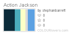
Dark blues back up the stability of working with a company as trusted as Jackson Therapy as white signifies clean, professionalism. Lighter blues and blue-greens suggest the fun, energy, and opportunity for travel provided by Jackson Therapy while pale yellow, with its happy tone, complements that message.
Lessons Learned
Whether you’re watching a great film or choosing your company’s website colors, subtext is a powerful tool that can either support or subvert the straightforward surface message that you’re aiming for.
With smart color choices you can be sure your website’s subtext is sending a message that backs up the other content available to your target audience. When all messages are aligned, you can bet your site will be more effective at delivering your message and results.
Rise Above,
Stephan

