Like so many houses on so many home makeover shows, some business’ websites simply need a makeover. Getting a website redesign doesn’t mean that the business itself doesn’t deliver amazing work, they could even be the best in their industry, it just means they aren’t articulating it digitally…yet!
While there are many aspects to a successful makeover, the most important is color choice. Think back to those TV shows. Arguably the largest change in the house with a purple exterior and bright teal accents was the switch to mature, subdued pebble-tones accenting a calm, cool columbia blue. Or the living room done in carnation pink with lemon-yellow daisies transformed to buttercream trim on pale moss walls.
Whether dealing with a house or a website, color is the most visually transformative aspect of any makeover. While content, layout, and user experience are inextricably tied to great digital design (I can’t even begin to explain how important each of those are…), the use of color will be our focus today in examining digital metamorphoses.
From Craptacular to Banktacular!
When we were approached by Central Florida Postal Credit Union to give their brand and their site a facelift, we had our work cut out for us. After initial strategy meetings, we were able to suss out what they wanted their digital brand to say about them: CFPCU is reliable and caring. That meant that a visit to their site needed to be enjoyable, educational, and easy to navigate.
Unfortunately, their old site did not relay that clearly.

While the colors present aren’t the most clash-worthy I’ve ever seen (they’re simply a muted variation of primary colors), those colors say soft, calm harmony as opposed to trusted, attentive, and dependable.
With their new site, we paid homage to their roots as a bank historically known for serving postal workers while catering to new customers looking for a bank that is solid, proven, and can take care of the needs of today’s banking clientele.

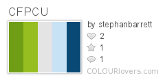
So how did we say all of those things with color? We used clean white background and a range of blues from pale sky to denim to royal, suggesting both a dependable sense of stability and easy-going experience for the customer, flanked by steel grey for steadfastness, and accented with lime green, hinting at their new goal of catering to a modern, energetic clientele.

Again, the initial site didn’t use awful colors. It used colors that didn’t speak to the brand message that CFPCU wanted to push. Once we pinpointed what they wanted to say, the appropriate color choices became more obvious.
Contempt of Color to Honorable Hues
When someone thinks of the courtroom, it should bring to mind the lofty ideas of justice, equality under the law, and the protection of individual rights, just for starters.
Unfortunately, none of those were thoughts that were stirred when looking at the old website for the Ninth Judicial Circuit Court of Florida.
Its stark white background and an unsightly left-justified list of links did nothing to project the sense of pride, organization, or respect that should accompany the halls of justice. In addition, the red accents of the navigation bar, the aforementioned links, and the waving animated gif file all suggested jarring warnings rather than helpful guides.


By contrast, after a complete renovation, the new site for the Ninth Judicial Circuit Court speaks to all of the ideals of peace and justice as well as the notion of the court as being not only a protector of the community but part of the community as well.

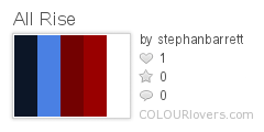
Backed with a deep indigo blue, the cities under the jurisdiction of the Ninth Circuit, featured in photos, now felt moored in the steady calm that dark blue suggests. Below the main photos, fully-saturated cornflower fades into dark lapis highlighting important information, including instructional videos and recent news. Both cornflower and lapis were chosen to continue the feeling of trust inherent in the color blue. Bright white copy stands out against the sober indigo, maintaining the perception of the court as a thoughtful steadfast institution.

The last color choice was the vermillion and crimson of the navigation bar. When combined with the already prevalent blue background hues and white copy, the overall palette hinted subtly at the colors of the federal banner of the United States and with it, the founding documents which enshrine the rights that the Ninth Judicial Circuit Court exists to protect.
Apparently, the color choices we made spoke very effectively to the desired persona of the court – shortly after the redesign for the Ninth Judicial Circuit Court was launched, another circuit court in Florida saw fit to redesign their site in almost exactly the same style and colors!
It Isn’t Easy Being Green
The color scheme used in the original website for the University of Central Florida’s Department of Sustainability and Energy Management (DSEM) was not technically unsavory. Nor was it necessarily inappropriate for the general idea behind the department’s mission and purpose, which is to make sure the buildings on campus are energy efficient, implementing and verifying energy optimization on campus, educating the on-campus population about such endeavors, and fostering sustainable growth.
While bright blues, greens, and white all suggest the sky, water, earth, flora, and air that the DSEM aimed to preserve, the choices weren’t special. The elementary nature of the colors did not convey the professional leadership role that the DSEM provides or the vision they had of themselves as providers of trusted information and educational outreach.

See what I mean? With the advent of their new site design, the Department of Sustainability wanted to communicate it’s core values, mission, and personality on first glance. Still maintaining earth-centric hues, the new colors are much more indicative of an organization that is grown up, level-headed, and an expert in their field.


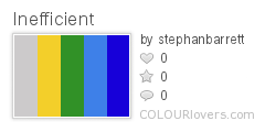
We wanted to select colors that still suggested earthy and organic concepts, but weren’t so cliched. Rather than using the original stark white background, we chose a mild khaki around the featured content at the center of the page. It manages to look bright and clean without being bleach white.

Steering away from the stereotypical bright blue of the original navigation bar, we opted for bright olive. Instead of being so bright as to be perceived as screaming, the more sophisticated green speaks calmly to what UCF’s Department of Sustainability is, a professional, earth-conscious association encouraging and educating faculty and staff on the importance of being a good steward of the natural spaces around us.
Makeover Take-Aways
With a clear idea of what you want to say about your brand, the best colors are much easier to figure out. You just have to know what you want to say and then say it with color. After all, your website is your digital face. It is often the first impression a person will get of who your company is and what it stands for and the quickest way to speak to those things is with sound color choices.
Do you have any favorite website makeovers where the change of color made all the difference in the world? If you have screenshots, post them up. We enjoy those almost as much as those home makeover shows. ;)
Rise Above,
Stephan