About This Palette
165 COLOURlovers viewed this page and think Aurelliana would win gold in an awesome competition.
Rank
N/A
Today
N/A
Week
N/A
Month
25,000+
All-Time
Description


I made this one as part of RC challenge for which I picked the color “techno” (the last very bright green in the palette). For me techno music was kind of odd, so I thought that the title makes a good match with the neon green. And I named the palette “Feels like heaven” simply because I’m constantly craving for music (more and more as time goes on), so sometimes it really feels like heaven (even techno haha)!

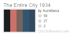
This palette is based on the work of Max Ernst “The Entire City”, one from his city series. I discovered for myself Max Ernst’s oeuvre couple of years ago, when I saw one his city paintings in a small museum in Paris and I fell in love with it. And this year I found another of his cities in Tate Modern. It was just an amazing chance to see it for real, I was standing there in awe…
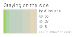

I really like this palette for its widths, uncommon for me. And for the color transition with a little green pop-up.
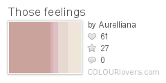

Ok, this one is quite cheesy. I yielded to the temptation to create a “girly” palette kind of dedicated to the relationship I had at the time. I built the palette on the base of color “let’s stay together” (cheesy, isn’t…). In that moment I was hoping I could work. Hehe, nope! So yeah, “those feelings", you know =P
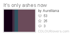

I created this palette for The Loved Colors Game. When I was juggling with the colors I realized they make a story. And the story perfectly fitted with my disconsolate mood in those days. Besides that I truly like all the five colors. I think it’s the rare case when the palette look even better with untoggled widths.
Colors
Share This Palette


Favorited By
Tags
Palette License
- Credit must be given to Aurelliana.
- Commercial use is not allowed.
- Derivative works are allowed, but must be shared with this license.
Post a Comment