The Controversy of Naked Colors
"It was color as such, naked color, unabashedly itself, and assertively dominant."
—Elizabeth Frank, Esteban Vicente
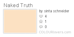
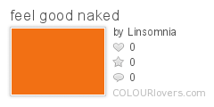
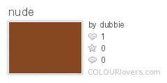
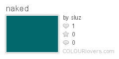
So-called "naked colors" expose a stark naturalness that many viewers would consider titillating or indiscreet. Naked colors invite the viewer to peek into an intimate range of wavelengths that yield a profoundly sensual impression and uncover a hidden truth. Naked colors embody what the French phenomenological philosopher Maurice Merleau-Ponty calls "interpenetration," wherein the fine line between a public arena and a private one starts "gaping open" (qtd. in Henry James and the Philosophical Novel, by Merle A. Williams, 1993). In other words, Merleau-Ponty is suggesting that a naked color on a visible surface can serve to lead the imagination toward something typically not visible.
Naked colors appear in the art world and the natural world. The red and gold Santa Rita mountains and the violet Catalina mountains of Arizona display a "wild bright beauty" of "naked color" (Glenn Hughes, Broken Lights: A Book of Verse, 1920). In the springtime in London's city parks, flower bulbs "break against the renewing grass in naked colour" (David Piper, The Companion Guide to London, 1983). In the Dutch painter Pieter Mondrian's later work, he focused his attention to "'naked' colour dynamics: patches of pure red, yellow and blue held in place by a grid of black lines (Jon Thompson, How to Read a Modern Painting, 2006). In the world of fashion, "naked color turns into decorationism" (Marc Chagall, Marc Chagall on Art and Culture, 2003). However, quantum physicists tell us that "naked colour is never to be seen" in quarks (Nigel Calder, Magic Universe: The Oxford Guide to Modern Science, 2003).
The COLOURlovers library is full of naked color inspiration. (Viewer discretion advised.)
Cover ![]() by auntie.
by auntie.
About the Guest Author, Craig Conley
Website: http://www.OneLetterWords.com
Craig is an independent scholar and author of dozens of strange and unusual books, including a unicorn field guide and a dictionary of magic words. He also loves color: Prof. Oddfellow
Color Inspiration: Beatriz Milhazes
Born in Rio de Janeiro in 1961, Beatriz Milhazes works in the pure aesthetic style of the Pattern and Decoration movement. Influenced by her native land of Brazil, her vibrant and bold use of color and patterns create work that is as much playful, free and psychedelic, as it is geometric, organized and rhythmic.
The Pattern and Decoration movement was not originally popular in the art world because of the movements lack of political statements and stances, "art for arts sake:" "Though playful and innovative, especially in the use of materials, Pattern and Decoration didn’t make much of an impact in the art world. It was dismissed as frivolous, with the work regarded as purely decorative and thus not warranting serious critical or curatorial attention." (NYT: Fresh Eyes on a Colorful Movement) What was deemed not worth talking about has now gained global visibility since its beginnings in the 70's and 80's.

Photo from tate.org.uk
The Decoration and Pattern movement is not completely detached from society and the world around it. I feel the art, and artists involved, take a very positive stance that speaks not from the created politics and mottos of the mind, but from love and the appreciation for the beauty that surrounds us. And this philosophy of focusing more on the pleasures of life, rather than its hardships, is very evident in the shapes, colors and patterns of each of Milhazes' piece.

Photo from James Cohan Gallery
Inspiration
Many of these explosions of colour originate in her small, compact studio, where she has been based since 1987. It is situated right next door to Rio’s luscious botanical gardens, and, inevitably, the forms and patterns of the flowers – delicate swirls and leaf-like shapes – have found their way into her paintings. She has also “taken advantage of the atmosphere of the city”, with its rich urban mix incorporating chitão (the cheap, colourful Brazilian fabric), jewellery, embroidery and folk art. Other influences range from architectural – the work of Roberto Burle Marx, the landscape architect and garden designer who created the five-kilometre Copacabana beach promenade in Rio – to Pop symbols such as Emilio Pucci fabric patterns. Painterly inspiration comes from the seventeenth-century Dutch artist Albert Eckhout, who travelled through colonial Brazil, and the Brazilian Modernist Tarsila do Amaral, as well as Mondrian, Matisse and Bridget Riley.
- In the Studio, tate.org.uk
Webby Awards Best Community Nominee x2
Being nominated for a Webby is a huge honor for any web company, but for our small start-up to be nominated two years in a row makes us proud of our work and very grateful to our members who built the supportive community on the site. With our 1,000,000th user-named color projected to be uploaded sometime later this month, we’re happy to report that the love of color is alive and well!
COLOURlovers : Best Web Community Nomination
 From now through May 1st, you can vote for COLOURlovers in The Webby People’s Voice Awards. Make sure to vote and leave a comment to let people know how wonderful our community is. This nomination is as much for us as it is for you.
Click Here to Vote for COLOURlovers
Thank you for all your support and color love!
(I know a lot of you are members of StumbleUpon & Flickr, I myself am a loyal member of those sites... but it is hard to win a popularity contest when competing with sites that have millions of members, but you all are the most supportive and awesome members around... so maybe we have a chance.)
About the Webby Awards
Hailed as the "Oscars of the Internet” by the New York Times, The Webby Awards is the leading international award honoring excellence on the Internet, including Websites, interactive advertising, online film and video, and mobile Websites. The Webby Awards is presented by the International Academy of Digital Arts and Sciences, a 550-person judging academy whose members include Internet co-inventor Vinton Cerf, R/GA’s Chief Bob Greenberg, "Simpson's" creator Matt Groening, Arianna Huffington, and Harvey Weinstein.
The 12th Annual Webby Awards received nearly 10,000 entries from over 60 countries and all 50 states. Only 15% of the entries were given an official honoree status and an even smaller number were put on the ballots as official nominees.
Color In Nature: Landscapes
From the red lava and black rock of newly forming land to the cool gray tundras and frozen lakes, a dynamic range of colors can be seen in landscapes across the globe. Some of the most dramatic colors can be seen in the very same landscape with the changing of the seasons. Pale yellow fields leftover from winter become rich green beds of brightly colored flowers just to become dark fading charcoal hills again in the fall.
Below we are exploring some of these lands filled with rich and absorbent colors created by minerals and climates, like the Pink lakes of Australia with pink salt lands contrasted against gray skies, the Painted Hills of Oregon with layers of peach sediment and rusty volcanic ash, and the tended green farm lands and pastures of Spain and England contrasted against blue skies.
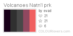
Volcanoes National Park, Hawaii | |
|
Photo by andyrs Established in 1916, Volcanoes National Park holds an incredibly rich diversity of environments that range from the ocean to one of earth's most active volcanoes, Kīlauea, which offers scientist a view of the formation of the Hawaiian islands. The parks also includes Mauna Loa a volcano whose summit reaches 13,6777 feet. |
|
Autumn Landscape, Japan

Photo by fotopakismo
 | |
|
Photo by andyrs The Skagit Valley Tulip Festival is held annually from April 1st - April 30th and celebrates the first burst of spring color. |

|
Colors of Greg Considine: ‘Reflections of Melbourne’
Taking inspiration from abstract expressionism, surrealism and impressionism, painters from Salvador Dali, Joan Miró, Jackson Pollack to Paul Klee, and using a 19th century window pane as his preferred medium of expression, Greg Considine has created an inspiring series of smoothly graceful, beautifully volatile and emotional reflection photos.
I got in touch with Greg to tell us a little more about his process of taking refection photos and the color inspiration behind his fluid and imaginative photo series 'Reflections of Melbourne'.

COLOURlovers: Tell me about your background.
Greg Considine: I have worked for a long time as a union advocate and recently took a long break to recharge my batteries. Prior to concentrating on reflections I used to shoot color and B&W digital infrared images as well as wildlife. Most of my time off work was spent taking photos, printing and exhibiting.

CL: How did you start taking reflection photos?
GC: As my photographic eye improved I started noticing them and found abstract expressionism, surrealism and impressionism ready made in old plate glass windows.

CL: Can you tell me about your process for taking your reflection photos?
GC: My favored medium for reflection is old 19th century plate glass-the old process produced sheets which were not flat and contain different densities and patterns-these distort the light nicely.
The key to my process is manually focusing telephoto lenses - I find 200mm, 300mm and 400mm all useful and sometimes I use a 600mm. My aim is usually to compose the photo so that the window surrounds are not in frame to reduce or eliminate cropping so that I can preserve large print size options. The right focal length lens enables this.
The Most Forbidden Color
The fiery color red has long been controversial — so controversial, in fact, that it is commonly banned outright lest it inflame strong emotions, spark revolution, kindle anger, inspire boldness, instigate bloodshed, arouse lust, or provoke pain. Is it preposterous to think that a single color can be dangerous to society? Consider the following examples of forbidden reds from modern to ancient times. Then ask yourself: do you dare to use or wear the color red today? Is red worth the risk of arrest, imprisonment, or even a death sentence? Ultimately, is red (or any color) worth championing?
Director Michael Mann banned the color red from appearing in his film Miami Vice, as he has a personal dislike for red and other earth tones. (Source: New York Times.)
The American Civil Liberties Union reported the first known instance of an educational institution reacting to gang fears by banning a primary color. In reaction to school vandalism and the threat of violence, "officials at Round Rock High School in Texas banned the color red. ... Apparently the gang responsible for these incidents wore red—about forty students wearing red items were sequestered in the library, and the parents were called." (Source: Leland Gregory, Hey, Idiot!: Chronicles of Human Stupidity.)
In 1887, Chicago police banned the color red from labor union advertisements of the Knights of Labor. This was a colorful example of the anti-Communist "red scare." (Source: Economic History Encyclopedia.)
Daniels Farm Elementary School in Trumbull, Connecticut banned its teachers from using red ink to grade student homework. Apparently, parents objected to red as being "too stressful" and symbolic of negativity. "The disillusionment with red is part of a major shift in grading, and three top pen manufacturers have heard the complaints. As a result, Bic, Pilot Pen, and Sanford (the manufacturer of Papermate and Sharpie) are producing more purple pens in response to rising sales. According to Pilot Pen’s vice president of marketing, school leaders are 'trying to be positive and reinforcing rather than being harsh. Teachers are taking that to heart.'" (Source: Lisa Orlando, "The Ink That Teachers Use To Grade Papers Has Parents Seeing Red.")
The government of Saudi Arabia banned the color red around Valentine's Day, in a move to discourage Muslims from observing the Western holiday. Red flowers, plush hearts, wrapping paper, and other red items were illegal to sell. As a result of the ban on red roses, a black market has flowered. (Source: Saudi Gazette.)
In Israel, the color red was banned from kosher clothing stores. (Source: Sensationalcolor.com.)
The Colors of Ancient Egypt
The roots of color technology trace back to Ancient Egypt, where visionary chemists concocted recipes for synthetic pigments. Color (Ancient Egyptian name 'iwen') was an essential part of life in ancient Egypt, adding deeper meaning to everything the people created. Paintings, clothing, books, jewelry, and architecture were all imbued with colorful symbolism. African historian Alistair Boddy-Evans explains that color "was considered an integral part of an item's or person's nature in Ancient Egypt, and the term could interchangeably mean color, appearance, character, being, or nature. Items with similar color were believed to have similar properties."
Egyptologist Anita Stratos informs us that the Egyptian palette had six colours:
 |
- red (desher)
- green (wadj)
- blue (khesbedj and irtiu)
- yellow (kenit and khenet)
- black (khem or kem)
- white (shesep and hedj)
Boddy-Evans notes that organic sources yielded two basic colors: crushed bones and ivory provided white pigment, and soot provided black. Red dye was produced from the dried bodies of female scale insects (family Coccidae, genus Kermes). Indigo and crimson pigments came from plants. Most other colors were made from mineral compounds, Stratos notes, "which is why they retained their vibrant colors throughout thousands of years."
Ancient Egyptians considered green to be a positive and powerful color, Egyptologist Geraldine Pinch notes (Magic in Ancient Egypt, 1995). It was associated with fertility, growth and regeneration. "A person was said to be doing 'green things' if his behavior was beneficial or life producing," Stratos says. "Wadj, the word for green, which also meant to flourish or be healthy, was used for the papyrus plant as well as for the green stone malachite. Green malachite was a symbol of joy. In a larger reference, the phrase 'field of malachite' was used when speaking of the land of the blessed dead."
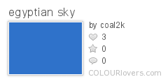
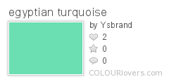
Blue and turquoise were considered divine colors and appropriate for sacred places. Stratos explains that "Dark blue, also called 'Egyptian' blue, was the color of the heavens, water, and the primeval flood, and it represented creation or rebirth. The favorite blue stone was lapis lazuli, or khesbed, which also meant joy or delight. . . . There is also a theory that blue may have been symbolic of the Nile and represented fertility, because of the fertile soils along the Nile that produced crops. Because the god Amen (also spelled Amon or Amun) played a part in the creation of the world, he was sometimes depicted with a blue face; therefore, pharaohs associated with Amen were shown with blue faces also. In general, it was said that the gods had hair made of lapis lazuli."
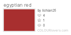
Stratos explains that red was considered a very powerful color, "symbolizing two extremes: Life and victory as well as anger and fire. Red also represented blood. . . . In its negative context of anger and fire, red was the color of the god Set, who was the personification of evil and the powers of darkness, as well as the god who caused storms. Some images of Set are colored with red skin. In addition, red-haired men as well as animals with reddish hair or skins were thought to be under the influence of Set. A person filled with rage was said to have a red heart."
"In the Graeco-Egyptian papyri, a special kind of red ink, which included ochre and the juice of flaming red poppies, was used," Pinch says.
Color and Industrial Food
In reading through the COLOURlovers' blog, it’s easy to see that food is a common inspiration for color lovers of all kinds, as well it should be! Color is probably one of the oldest tools for knowing how to navigate the ancient grocery store of the forest.
Yet as many people know, our mono-culture food system is also going monochromatic. With so much variety out there, why are our apples and tomatoes almost all red? And how did our corn get so yellow?
Why Red?
“Apples of New York,” a 2 volume encyclopedic listing of apples grown in New England during the 1800's, lists over 1,000 varieties of apples, yet today we’re lucky if we find 10 in all the grocery stores across America and almost all of them red: Honeycrisp, Cameo, Red Delicious, Braeburn, McIntosh, Jona Gold, Fuji, Gala, Courtland, Empire, and Golden Delicious.
In the early 1900's Washington State Apple Growers launched an expensive promotional campaign to market just one apple: The Red Delicious. Their campaign to sell the Red Delicious centered on the idea that the color red is an indication of ripeness in apples, regardless of variety.

Photo by Gracie
Growers all over the country started to select trees that produced the reddest fruit without selecting for taste or nutrient value. Because of the mono-culture around apples, today the Red Delicious is among many apples plagued by diseases and pests, making it very difficult to grow organically.
The Washington Growers didn’t choose the Red Delicious because of it’s nutritional value, or even because of it’s flavor. They chose it because it doesn’t store well and doesn't show bruises. They chose it primarily because Washington State has the best climate in the country for growing Red Delicious apples.
Too Much Maize
Corn is another crop that has gone the way of the mono-culture. A quick internet search finds you over 100 varieties of corn, or maize, yet all we grow in this country is sweet corn and feed corn.

Photo by Jimmedia
Colors In Nature: Aurora
There is at least one thing to be said about living in colder climates, and that would be being able to experience, first hand, one of the color wonders of the world, aurora.
Aurora originates from the sun. Large amounts of solar particles are thrown into space and travel for about two to three days at a rate of 300 to 1000 kilometers per second in order to reach earth's outer magnetic field. At this point, the clouds of particles are pulled towards the northern and southern magnetic poles. As they are being pulled towards the poles they are stopped by our atmosphere colliding with other present particles. The interaction of these particles causes what we know as aurora, the northern lights or aurora borleis in the northern hemisphere, and aurora australis or the southern polar lights in the southern hemisphere.

Photos by Arnar Valdimarsson
The colors created by aurora are most commonly, green and red, but depending on the particles present in the clouds from the sun, say if there is nitrogen present, the color can range from low level reds to very high blues and violets.
With the technological advances of film and development of digital imaging we are now able to capture the true beauty of auroras, but it still nothing compared to witnessing the animated currents of color flowing over the horizons and covering landscapes with illuminating waves of light for yourself. So enjoy these stunning images of this magnificent show and give some thought to taking a cold vacation this year.

Photo by natekoechley
COLOURlovers API Documentation and Showcase
With the release of the COLOURlovers API, you can now access 1.4 million named colors and more than 500,000 color palettes for your creative projects and applications. Creating a theme editor and want to give your users some color theme options? Creating a visual project that ties keywords to colors? Who knows what amazingly creative stuff people will come up with.
Below are two showcase examples of the COLOURlovers API in action as well as the full API documentation. Happy API COLOURloving!
COLOURlovers API Usage Showcase
Desktop Color Search - AIR App
Desktop Color Search is an Adobe AIR app that runs on your desktop and allows you to search the entire COLOURlovers database for colors, palettes and patterns. You'll need to download the Adobe AIR runtime in order to run Desktop Color Search, you can use the link below to install AIR. (It works in both Windows and on Mac OS X)
Special thanks to Levi McCallum at FutonMedia for coding the AIR app.
Download Desktop Color Finder | Download Adobe AIR

DEKAF LOVERS
A simple interface to COLOURlover's deep, deep palette library, it creates randomized compositions using rectangular geometry drawn by the Degrafa drawing library.
Have some fun of your own color fun with Dekaf Lovers.


