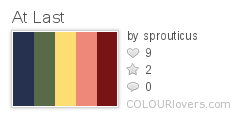
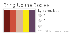
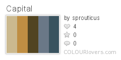
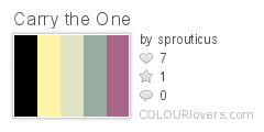
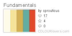
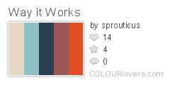
Allegedly we’re not supposed to judge a book by its cover, but let’s be honest, when you’re browsing a bookstore (online or off) it’s the good designs that catch your eye and draw you in for further investigation. And when it comes to catching people’s attention, what better way than with a little bit of color.
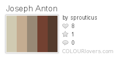
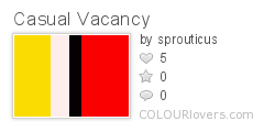
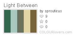
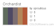
While there may not be one definitive “best of” list of books, there’s still a lot of smart people out there that put out their own lists, so we decided to take a few of these and compile them into one colorful literary collection. Let’s take a look at some of the best books from 2012 and the colors of their cover designs.
If we’re looking for trends, the vast majority of these covers utilize earth tones like browns, tans, blues, greens, and oranges. Such palettes are pleasing to the eye and viewed easily. They feel natural, friendly, and less intimidating for potential readers. So really, earth tones make a lot of sense in an industry where you have but a brief moment to catch someone’s attention. Perhaps Hollywood poster designers could take a few cues from the publishing world on embracing color and give us a break from the drab posters of late. Or maybe that’s just wishful thinking.
What were some of your favorite books this year?


