Ah, the mailer. It is a rare business that hasn’t utilized this tried and true form of advertising. I’ve even used it at Rise and we’re a digital agency. For small enterprises looking to reap its benefits at the local level, the United States Postal Service has recently rolled out a new service that may harness the mailer’s return on investment in a powerful way. While that information is excellent, I want to also highlight the importance of effective color choices for mailers. No sense sending out an ineffective mail piece, after all. Even if it’s super easy and cheap to do.
Effective Color Choices for Mailers
When a business is ready to start sending out mailers to the surrounding areas the question then becomes: how to design the mailer? Color plays an important role here, but it’s important to make sure it doesn’t overpower.
Some things to keep in mind when choosing colors for a mailer:


If budget is a concern, good ol’ black type on white paper is practical and legible. A little plain, but not a bad choice all the same. If possible, using at least the minimum of colors (two = minimum to me) is better. It gives you an accent color to work with and can look better than going color-crazy which is both expensive and can look unprofessional.


Yellow and red are excellent colors for headlines, phone numbers, and various other “hot spots” or calls to action. If you choose red, just be sure it looks red as opposed to purple or pink. There are a few colors that are just hard to work with and should be avoided such as orange, brown, and pink. They are often tricky in that they have a tendency to print differently than intended. That said, while orange is tricky to get right, it is also underused and an attention grabber. Feeling bold and think you can pull it off? I say take the risk. I’m one of those people though.


When in doubt, go with blue. It’s a favorite among men and women across cultural lines. It lends itself to legibility, looks good in varying tints, and draws attention without being distracting.

One of the best uses for color in a printed mailer is in photos or illustrations. These graphics allow a layout to standout without muddying the copy, keeping it legible. Most people like legible.
Resource: Direct Mail, Locally, Easily
USPS has just unveiled a new mail service called Every Door Direct Mail Retail. It allows small businesses to market to every address in the neighborhoods surrounding their business. Unlike traditional bulk mailings, this service allows an enterprise to mail out targeted mail pieces without having to purchase a postage permit or rent a mailing list. Between saving money and time, this service offers some excellent opportunities for entrepreneurs.
There you are, lovers! Go forth and correspond colorfully not to mention quickly, easily, and economically.
Until next time!
Rise Above,
Stephan
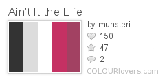
High Contrast Palettes for a Dramatic Message.