Join in the Colorful Conversations
Looking for answers to your color questions, have some advice to give... or simply want to get to know your fellow COLOURlovers? You're in the right place.
Palette Makeover Game
Create New TopicShowing 81 - 100 of 115 Comments
I actually quite like that palette. I think it looks just as good with the default color widths.

Darkened the red just a little, and mostly just brightened up everything else. I made the purple a bit more red for contrast. The blues I saturated. I kept the color widths and order.
I like the greens & the concept, but for some reason it just doesn't look the way I want it to. It could be the bluer green in the middle, I'm not sure.
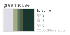
I really love your "greenhouse" I love the dark teal and stuff. All I did is just changed the weird green into another color that blends well with that green-teal.

All I know is that I don't know where to start...
The colors are a lovely blend, but they are all fairly similar. I just lightened the first yellow and darkened that last green for a little more contrast and impact. Otherwise, I just flipped the colors around and tweaked the widths.

This is an old, old one of mine that I rediscovered. I like the idea, just not the execution.
I also loved the concept, just needed to tweak the greens and brown a bit to let them fit with the blues. The green got muted, and I bumped the value of the yellow up a few points so that it contrasted better with the new green. Then I chose a new "leather" color that I felt complimented the whole. I hope you like it!

Here's another Native American themed one. It was supposed to have a South-Western vibe, as suggested by the image on the badge, but I think it ended up a bit too garish. As this was originally created for a color-of-the-day challenge, I would like a rework that leaves the original blue as-is.

I liked the original palette and could really see the native american theme you were going for, but I prefer duller colors so I just de-saturated most of the colors and changed the order :P don't know that I fixed it at all

one of my first palette haha
i wasn't going for anything in particular, just messing around. I like that its kind of dark and dusty with a hint of that blue, but it just seems TOO dull i think and I don't really see a harmony with the colors
I started by changing the color order so that they went from darkest to lightest. That improved things a little, but it didn't really seem right. It still seemed to lack harmony. So I changed the darker tan to a light blue, and it seemed much better. I tweaked the colors just slightly to give them more contrast. I also saturated the blue a little more.

Not entirely sure what I was going for here, but I do know it wasn't this. The yellow really clashes with the pink to the point where it's painful to look at.
Not sure how well this worked. I mostly reduced saturation but also removed the bright pink, slid over the slightly changed light pink and added a lighter pink.
This is one of my very first palettes. I was trying for 1970s colours and it's not bad, but it could do with a makeover.
This is one of my very first palettes. I was trying for 1970s colours and it's not bad, but it could do with a makeover.
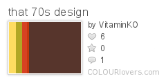
the middle color of the original palette was bothering me, so i decided to make the palette use mostly oranges/reds since that's always seemed to me to be the predominant color for 70s design. the brown has the greatest width since it reminds me of wood panelling that covered entire walls.
i think this palette is okay enough, but i think it could still do with a makeover. it's very bland in my opinion.
I liked all of it except for the third color, so I just switched that out for an orangey color and did some rearranging.
This looked much better in PHOTOCOPA than it does on the palette page... I think the dark purples are too close together in shade.

This looked much better in PHOTOCOPA than it does on the palette page... I think the dark purples are too close together in shade.

First, I rearranged the colors. I put the darker colors next to each other so that you could see the contrast more clearly. Then I lightened them all just a little bit, so you could see the difference. I feel like COPASO and PHOTOCOPA give darker colors a lot more contrast, so I made sure I was actually making them different enough to show up on the palette page.
I don't really remember what I was trying to do here, but it looks a bit sharp and too bright.

Just toned down the colours overall.
This palette is moody and dark, which matches the painting it's based on, but I'd like to see a new version.

ehh... nothing to say about this one.
Need help:
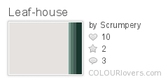
my first palette. i want this to make it cozy


Hiya Scrumps. Hope this is cozy enough for you! I muted all of the supremely bright colors, darkened the dark green and lightened the other until it blended with the rest.
Needs Help:
I was never really sure about this one (can you tell?), and have no idea how to make it work now. It was for a color-of-the-day challenge, so please leave that color alone. Otherwise, go nuts!
Personally, I like to make the colors line up in a nice gradient. So I started with that in mind: I lightened the indigo & purple, and then I darkened the green. The green still looked out of place, so I changed the hue until it looked like it fit.

Something about this is just... off. I think the greens are messing with the tans. I don't really know.

I lowered the saturation and tweaked the hues and brightness of the colors so the transition from pink to green was smoother, and I altered the widths so the distribution of dark and light colors was more on the light side.
I'm kind of meh on this one. There are parts of it I like, but I'm not wild about it. I'd be interested to see what someone else does with it.

I liked the original palette so I can't really say that I improved it haha. I got rid of the third color and added the dark/dull color at the beginning so there was more contrast. Then I changed the 4th/greenish color to an icy blue. I think it looks nice like this (I'm a sucker for browns and dull colors) but it's also missing the kind of dreamy vibe from before
and old palette. I like the neutral tones but this palette is just boring haha. Maybe liven it up?

I arranged the colors in order from darkest to lightest and saturated all of them a bit, except for the dark grey, which is still a pure grey. I liked how the browns (in the original palette) consistently changed hue from orange to yellow-orange, so I tried to emphasize that as much as possible.

Something about this looks wrong. I don't like the yellow.

I red shifted the pinks and yellow a bit to create a more gradual transition, and also changed the tints so each color stood out a bit more from the ones around it. The green I saturated a little so it contrasted the orangy-yellow more. When you have to many saturated colors of different hues together it tends to make your eyes hurt because the vibrate to much. I think now the palette is a tad softer and easier to look at. I shifted the widths a bit to give the green more prominence since it is a "jungle" palette.

This is a terrible blah palette I made long ago. Someone dress it up.
I liked the essence of the original but I felt it lacked contrast to make it pop out, so I heavily darkened the grey and nudged it more towards blue, and pulled the neutral tones towards red to allow the stripe to blend in, hopefully counteracting the popout effect of the cold-warm contrast added by the previous shift. But they were still too grey and it was making the red stripe blinding, so I saturated them even more. But then I felt the essence of the original had been lost. So I did lots of them as an apology:


________________________________________________
Anyway onwards to my moppy palette:
I made this one a few days ago but it's been nagging me ever since. That yellow progression just ain't right.
You must be logged in to post a comment.
Recent Discussion Comments
paulsky555
2024 UPDATE GOOD SELLER
CVV - FULLZ INFO - DL PHOTO - FULLZ DEAD
HOT AND FRESH UPDATE
Telegram: @Paulsky555
CVV - FULLZ INFO - DL PHOTO - FULLZ DEAD
HOT AND FRESH UPDATE
Telegram: @Paulsky555
paulsky555
2024 UPDATE GOOD SELLER
CVV - FULLZ INFO - DL PHOTO - FULLZ DEAD
HOT AND FRESH UPDATE
Telegram: @Paulsky555
CVV - FULLZ INFO - DL PHOTO - FULLZ DEAD
HOT AND FRESH UPDATE
Telegram: @Paulsky555
paulsky555
2024 UPDATE GOOD SELLER
CVV - FULLZ INFO - DL PHOTO - FULLZ DEAD
HOT AND FRESH UPDATE
Telegram: @Paulsky555
CVV - FULLZ INFO - DL PHOTO - FULLZ DEAD
HOT AND FRESH UPDATE
Telegram: @Paulsky555
paulsky555
2024 UPDATE GOOD SELLER
CVV - FULLZ INFO - DL PHOTO - FULLZ DEAD
HOT AND FRESH UPDATE
Telegram: @Paulsky555
CVV - FULLZ INFO - DL PHOTO - FULLZ DEAD
HOT AND FRESH UPDATE
Telegram: @Paulsky555
paulsky555
1 day ago
$$$$ Hot Hot Hot $$$$
You need fullz to register Create driver accounts spark driver, Contact me now
Telegram: @Paulsky555
You need fullz to register Create driver accounts spark driver, Contact me now
Telegram: @Paulsky555
Latest Articles
//View More ›Posted in News
Posted in __PRIMARY-CHANNELS, _OTHER-CHANNELS, Design, DIY, Office, Home
Posted in __PRIMARY-CHANNELS, _OTHER-CHANNELS, Art, CHANNEL-DIGITAL-ART, OTHER-DIGITAL-ART, Tutorial
I love the colors in the above palette as well. I kept the bright green and bluish grey, and made the pink more magenta and swapped the red for another green. I changed all the widths, and rotated a couple of the colors. I don't get too much more excited then when I buy a new pair of running shoes! :o)
Kind of tired, and old fashioned. I don't think this pattern is very modern at all.